According to this BBC article (http://www.bbc.co.uk/news/business-24177834) Micheal O’Leary CEO of Ryan Air has taken responsibility for its unnecessarily abrupt culture and vowed to make changes to avoid causing its customers the type of distress that has too often been associated with flying Ryan Air.
No doubt many of those reading this blog will have had some experience with Ryan Air, those who use Ryan Air frequently, can be divided into two camps. The loyalists, who appreciate the efficiency of their model, which treats courtesy and manners as an unnecessary social burden, interfering with the optimal operation of an airline and the other camp; the begrudging accepters who want to fly on a budget and have no choice but to fly one of Ryan’s routes.
As a member of the latter group, I did myself learn the hard way that there is no “grace” when flying with this carrier. You follow the rules, to the letter or pay. On the one hand, I can see the argument for that, they are rules and mostly they are very clearly communicated in advance. However this is not a consistent behaviour on behalf of Ryan Air, because using their website is like walking a tightrope, over a minefield doing a Sudoku puzzle, blindfolded while having a badger gnaw at your arm. Okay, maybe not that bad, but it is terrible.
Ryan Air is something of a digital pioneer. Launching its Web service in 2000, online bookings were a small part of the site and the aircraft flew to a published timetable, rather National Express like in concept, but for the skies. Very quickly however, online bookings were seen as the way to cut out travel agents from the deal and focus more on direct sales to flyers. The pattern had been set now for the decade to come.
Roll on 2013, a decade of growth and profitability; a mountain of mostly negative press, Ryan Air has become a byword in irresponsible capitalism, poor customer service and miss-selling. With their profits in decline and some recently high profile losses in court, Ryan Air is having a change of heart. I thought as a customer, I would magnanimously identify a number or areas where they could improve their website, from a user experience perspective with better web design. The best thing about this is, from Ryan Air’s point of view is that it should make it easier for site visitors to complete purchases.
The Homepage
This has always been a bit of a mess. Ryan Air has long advocated the flashing lights and bright colours approach to marketing. By bombarding visitors with a plethora of competing messages that sometimes flicker and move about. This makes it very difficult to find specific information that is relevant to the journey you want to make. Awesome as it is that I can fly anywhere for £14.99, the homepage messages need to be streamlined. However, this is not the worst part, overall the home page it okay. When you start navigating the site, it starts to wear its age very badly.
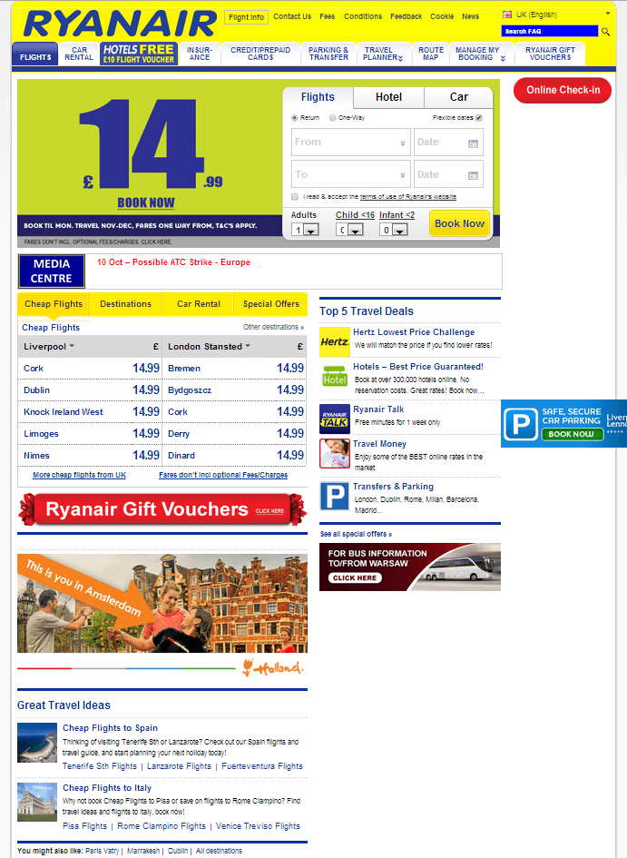
Ryan Air Homepage, clutter much?
Deals Page
Ryan Air are always shouting about their deals, and it is true, they are the cheapest way to fly, those deals are amazing. If you click on the eye catching banner, you get shown a bunch of ridiculously low priced fares. However you soon learn when you try and replicate these fares that they are not easy to achieve accept under certain quite exact parameters. Not misleading advertising, but not far off. Generally speaking, the relationship between the offered deals and the booking engine is poorly integrated and clunky. I am aware that filling this many seats through an online booking engine is not easy but there is lots of room for better web design here to make it easier to take advantage of the special offer fares.
Booking a Flight
This is where it starts to get weird. If you can look past how ugly and dated the booking widget is and how very small all the fonts are. You get what is a pretty functional if outdated interface for booking a flight.
Birmingham to Fuerteventura on the 27th of November for 2 adults returning 4th December, simples.
The first thing I see on the next page is a ReCaptcha tool for identifying humans. No! Wait it isn’t, this is great, they have replaced it with Solve Media’s Captcha Type In. This is a huge improvement. ReCaptcha was a terrible thing, very happy to see people thinking outside the box and using more sophisticated systems. Ryan Air, you get a point there, keep up the good work.
So, on the next page, I can see what flights are available. Ryan Air only fly this route on a Friday, that’s okay, I can change my dates a little. I select my flights and get a pretty transparent breakdown of the flight fees, taxes included. £169.34 to be paid by debit card, or a small premium to pay by credit card, that’s okay I suppose.
Next is the bit that really gets under my skin. The up-selling. Okay first it’s luggage, aside for the fact that is actually quite expensive, this bit works okay, but really £40-60 for a single bag, ouch! Next comes the worst bit, Insurance, this is guiling because most of the people flying Ryan Air are Europeans visiting European destinations and don’t really need insurance. It is not easy to understand how this widget works and its tricky to find right at the bottom of the list (it used to be in the middle) the option to proceed without insurance. This is a bit of irresponsible miss selling, and Ryan Air should drop it. The other up-sell areas work well enough but they are a bit annoying with their small buttons and tiny fonts, this process just takes far longer than it needs to. Better web design is really needed in this section.
I think that this would be the biggest drop off area on the site, its cumbersome and frustrating. If Ryan Air wants to improve the buying experience, this is a good place to start. Working harder to get this part of the site working well should even have a positive effect on sales.
Tickets
E-tickets are great, Ryan Air isn’t there quite yet, you do get a confirmation of your booking sent to you by email. This is great but you usually cannot print your boarding card right away. That usually happens closer to your flight date. YOU MUST PRINT YOUR BOARDING CARD. For reasons that they have never felt inclined to explain, Ryan Air has always had massive penalties for arriving at check-in with no boarding card. Having it available on a mobile device will not do. This needlessly draconian approach has caused a great deal of distress for many flyers who have to fork out £30 each way for new boarding passes. This leads neatly onto the biggest trick that Ryan Air are missing.
Mobile
It is bewildering how little interest Ryan Air have in catering to the mobile audience. For the longest time, they swore they would not introduce an app, and then they said they would make one but it would be a paid app. They have since released a free app and it is quite rubbish. It is utterly slated in reviews. It is easy to see why, it is a cheaply implemented cross platform sort of thing, with the aesthetic values of well a Ryan Air CEO.
This is a real opportunity for Ryan Air to step into the real world of 2013, the year tablets outsell PCs, when everyone and their dog owns a smartphone. Redeveloping their website to be responsive would be lovely but probably a bit too onerous for the organisation, however a new stab at apps with a serious attempt as creating a native solution for iOS devices and Android devices could go a long way. So would being able to scan e-tickets from a mobile device. These would eliminate a great deal of the hassle from managing a flight. It would be a great opportunity to make buying tickets easier. If there was a membership function on the app, it could store user and additional passenger information on the app. This would make booking flights much less onerous and perhaps engender some loyalty rather than animosity from existing clients.
Conclusion
The time is right for a change of heart from Ryan Air management, put a softer face on to the world and plug in a sense of humour and appreciation of what it means to be a human being. Spend a little bit of money (less than one decent lawsuit) on user experience, better web design and some new apps and learn that no frills can also mean efficiency, and efficiency, not meanness is the route to profit.