The concept of using contrast in web design is not a new one. For a long time, it has been known that having elements of a design that stand out will draw attention to them. We can see this in lots of examples: logo design, packaging design, movie titles, web pages etc. Contrast is not always used to its maximum potential, however, and many designers and producers over-use the concept of contrast, which will remove all chances of anything standing out on its own. Here are some things to consider when using contrast to draw maximum attention to a single element of a design:
What do you want people to focus on?
Try not to use contrast just for the sake of it. It should always have the purpose of drawing attention to a specific element; whether that is a call to action button, a heading, a quote, an advertisement etc. Use colours, shapes and other design elements to create visual contrast.
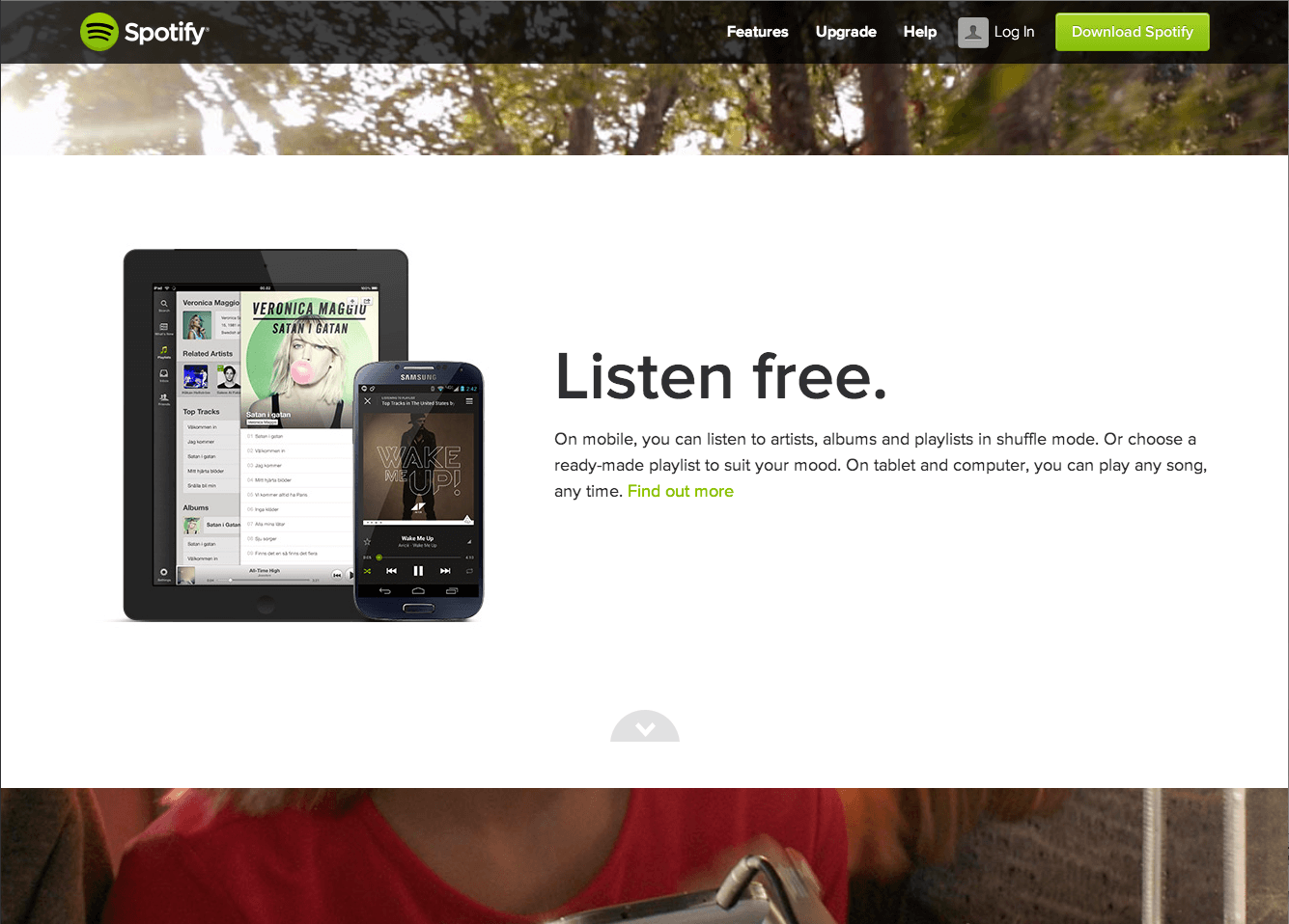
Example: www.spotify.com/uk/
Spotify use green as the focus colour on their web design. It is used for important Calls to Action (CTAs). See bottom of page.
Maintain consistency with your branding.

When thinking about using contrast in design, consider the branding that already exists. Is there already a colour within the branding that should be used as the contrast colour? If not, use something like Kuler to find out what a complimentary contrast colour could be.
Example: www.hubspot.com/what-is-hubspot
Hubspot’s about page uses the orange colour from their logo to highlight many different elements and to draw the user’s attention to them.
Consider using movement
Movement attracts people’s attention. The increase in engagement from a static image to a video clip or motion graphic can be huge.
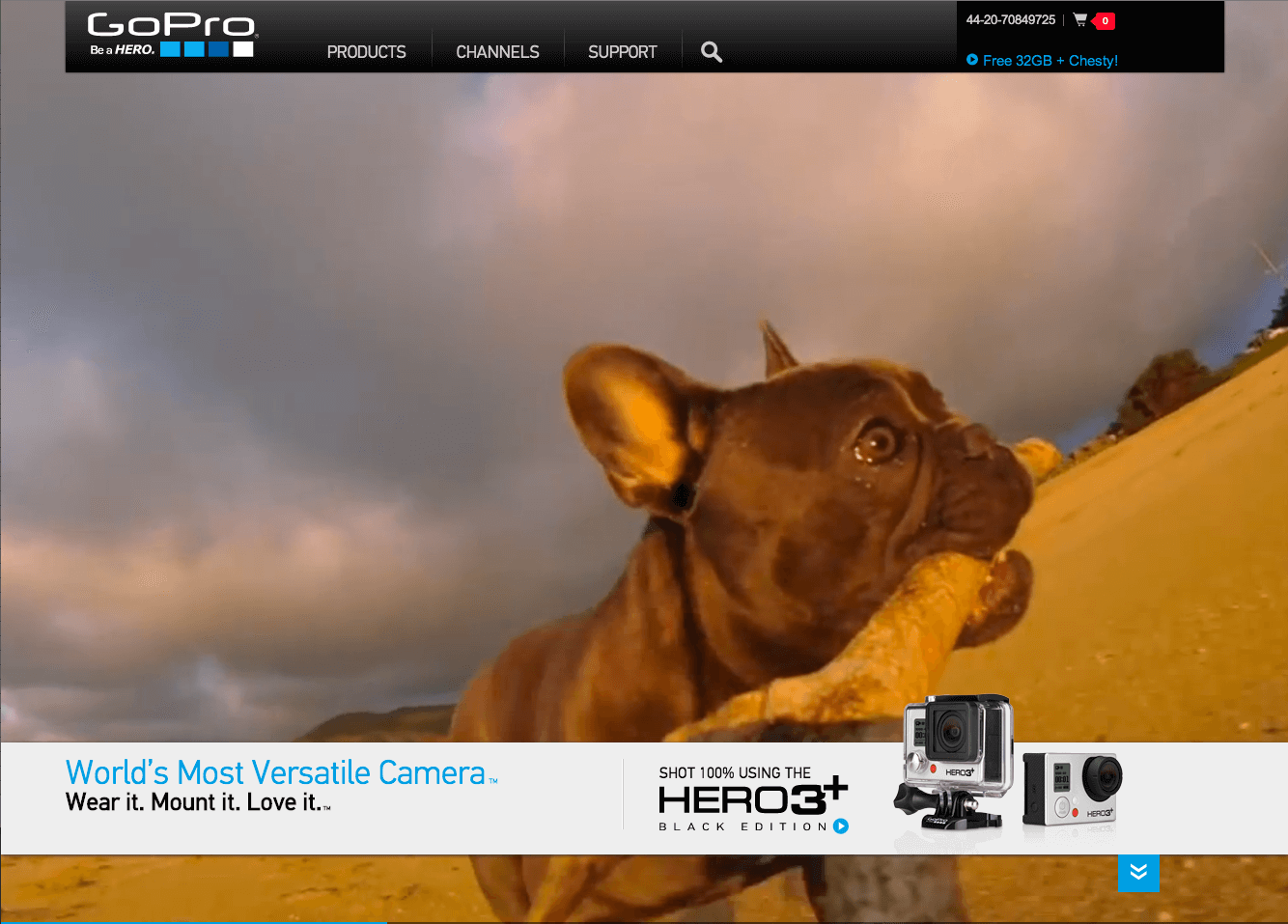
Examples: gopro.com/ (use of full screen video when arriving at the site) www.costa.co.uk/experience/ (parallax scrolling effect creates excitement and engagement)
Use the element of surprise
You can bring contrast to your web design by adding the element of surprise. This can be implemented through sudden movement and sounds, and can also be achieved in a more abstract way, by presenting an element or an object that would not usually be found in such an environment.
Example: neversawthelightofday.com
Animations and movement have been used on this site to show off a product.
Addition Vs Subtraction
Contrast isn’t always achieved by changing the colour/appearance of an element. Adding an element or subtracting an element can also achieve this sense of contrast.
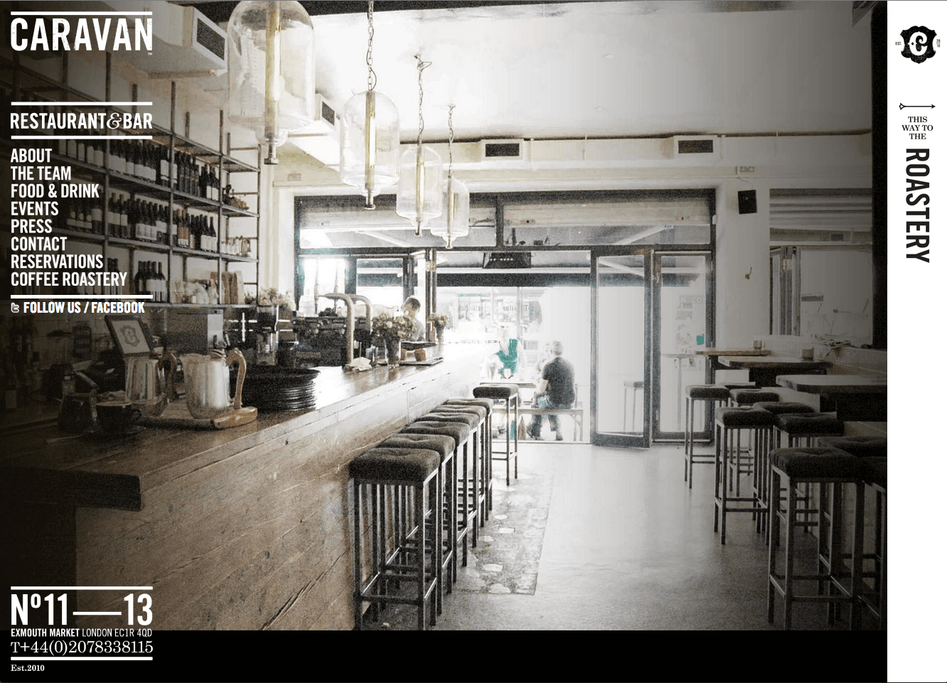
Example: www.caravanonexmouth.co.uk/
This site makes good use of space to show off the beautiful imagery.
Here are some examples of recent projects that we have worked on that demonstrate the power of contrast – Our bespoke web design services are great if you’re looking to update your website’s design:
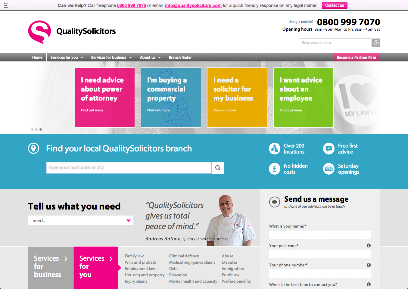
Quality Solicitors – www.qualitysolicitors.com
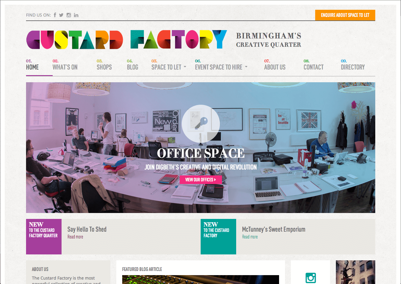
Custard Factory – www.custardfactory.co.uk