
When Flexbox was presented to the world, front-end devs were still containing their excitement. New layout standard for the Web became a fact, but what about older browsers? That was one of the reasons why developers were using flexbox with a lot of uncertainty.
Today we know more and we can do more!
What is Flexbox?
Flexbox (or Flexible Box) element can redistribute its children by altering their width and height in the best way possible. It can also change the order of the elements without changing the markup.
Why is flexbox better than floating elements?
When using flexbox, your markup is clean and you don’t need to add any additional nodes. Whereas, when using floats you have to always remember about clearing the float so the page wouldn’t break. It means adding another div or pseudo-elements. Moreover, you have to have exact widths of at least one element to make sure they all would fit in a row. It’s not safe, especially when working with a mobile-first approach.
Cross-browser issues
When using flexbox, our main problem is IE. Unfortunately, IE older than IE10 doesn’t support flexbox at all.
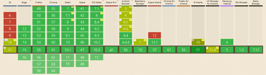
source: caniuse.com
Thankfully there are prefixes that let us control older browsers behaviour. We can’t forget about the order of prefixes and trust me – that is one of the most common mistakes when working with prefixes in CSS. The rule is to use old syntax before the new one so if the browser understands new options, those should be used.
The most common issues with old browsers
Default values
In IE10 the default value for flex is 0 0 auto rather than 0 1 auto as defined in the latest spec. It’s always better to add flex: 0 1 auto to all the flex element children even when we don’t change the default values.
Min-height and height
Safari and IE have some issues with calculating the size of flex items when min-height is being used. Also, I’ve noticed some issues with setting the height: 100% to the element inside flex child. Adding display:flex to the flex child fixed the issue.
justify-content: space-evenly
The latest value added to justify-content option distributes items evenly. Children have equal space around them. Unfortunately, this very useful distributed alignment is supported only in Firefox browser.
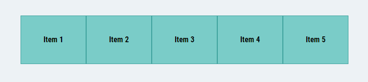
Basic flex
When using flex, we can use some settings to make the container, and its children, even more flexible.
HTML:
<section class="basic-flex">
   <div>Item 1</div>
   <div>Item 2</div>
   <div>Item 3</div>
   <div>Item 4</div>
   <div>Item 5</div>
</section>
SCSS:
.basic-flex {
     display: flex;
     &>* {
         flex: 1 0 auto;
         display: flex;
         justify-content: center;
         align-items: center;
     }
}
In the code above I use display:flex for the parent element and for children I combined flexbox with some additional settings. What happens here is that div .basic-flex redistributes its children equally but also every child puts the text exactly in the middle, not only horizontally but also vertically. Sure, we could use simple line-height but then we need the exact values.
Cross-browser flex options
The best approach is trying to work with the oldest browser possible. If you are already adding prefixes, you can easily add them all to make sure that your css code is bug proof.
Surely it would be easier if cross-browser prefixes were JUST prefixes. In reality, we have many different options.
Here are all the flex options possible with important prefixes.
display: flex
    display: -webkit-box;
    display: -webkit-flex;
    display: -ms-flexbox;
    display: flex;
flex-direction: row;
    -webkit-box-orient: horizontal;
    -webkit-box-direction: normal;
    -webkit-flex-direction: row;
        -ms-flex-direction: row;
            flex-direction: row;
flex-wrap: wrap;
    -webkit-flex-wrap: wrap;
        -ms-flex-wrap: wrap;
            flex-wrap: wrap;
flex-flow: row wrap;
    -webkit-box-orient: horizontal;
    -webkit-box-direction: normal;
    -webkit-flex-flow: row wrap;
        -ms-flex-flow: row wrap;
            flex-flow: row wrap;
justify-content: space-between;
    -webkit-box-pack: justify;
    -webkit-justify-content: space-between;
        -ms-flex-pack: justify;
            justify-content: space-between;
align-items: center;
    -webkit-box-align: center;
    -webkit-align-items: center;
        -ms-flex-align: center;
            align-items: center;
align-content: center;
    -webkit-align-content: center;
        -ms-flex-line-pack: center;
            align-content: center;
flex: 1 0 auto;
        -webkit-box-flex: 1;
        -webkit-flex: 1 0 auto;
            -ms-flex: 1 0 auto;
                flex: 1 0 auto;
flex-grow: 1;
        -webkit-box-flex: 1;
        -webkit-flex-grow: 1;
            -ms-flex-positive: 1;
                flex-grow: 1;
flex-shrink: 0;
        -webkit-flex-shrink: 0;
            -ms-flex-negative: 0;
                flex-shrink: 0;
flex-basis: auto;
    -webkit-flex-basis: auto;
            -ms-flex-preferred-size: auto;
                flex-basis: auto;
order: 1;
        -webkit-box-ordinal-group: 2;
        -webkit-order: 1;
            -ms-flex-order: 1;
                order: 1;
align-self: flex-end;
        -webkit-align-self: flex-end;
            -ms-flex-item-align: end;
                align-self: flex-end;
Nobody remembers about all the prefixes!
Sometimes it’s tricky to remember about every prefix possible. That’s why I always try to make the whole process easier and faster. In my everyday routine, I work with GULP. It converts my scss files and adds prefixes on the fly.
If you don’t use any toolkits, you can always try online generators. My favourite is Autoprefixer CSS online.
Knowing all the common prefixes, I can rewrite my previous code:
    .basic-flex {
        display: -webkit-box;
        display: -webkit-flex;
        display: -ms-flexbox;
        display: flex;
        &>* {
            -webkit-box-flex: 1;
            -webkit-flex: 1 0 auto;
                -ms-flex: 1 0 auto;
                    flex: 1 0 auto;
            display: -webkit-box;
            display: -webkit-flex;
            display: -ms-flexbox;
            display: flex;
            -webkit-box-pack: center;
            -webkit-justify-content: center;
                -ms-flex-pack: center;
                    justify-content: center;
            -webkit-box-align: center;
            -webkit-align-items: center;
                -ms-flex-align: center;
                    align-items: center;
        }
    }
Hello Bootstrap 4
Learning more about flexbox is a necessity if we want to work with the new Bootstrap 4. Bootstrap was completely rewritten and it’s using flexbox as a base for its grid. Welcome to the future of frontend!
Have fun with browser testing and fixing all the cross-browser issues! If you want it done for you without the effort – we are here for you!