
As a Front End Developer, I’m always looking for new and useful front end tricks. Maybe it’s not necessary but it’s so much fun that I can’t resist.
I often struggle with responsive navigation. I don’t like the idea of using JavaScript with it as it is, in my opinion, too much for a simple menu. Can it be done just with CSS? No. We need a cross-browser solution, so JS will be needed but my plan is to use JavaScript only for opening/closing navigation. Is it possible? Let’s try.
Guide for responsive CSS navigation
Basics
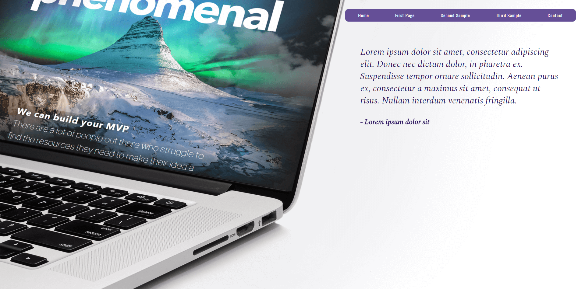
My basic code is simple. I am using display: flex to evenly redistribute all the items.
HTML
<nav>
    <ul>
        <li><a href="/">Home</a></li>
        <li><a href="/">First Page</a></li>
        <li><a href="/">Second Sample</a></li>
        <li><a href="/">Third Sample</a></li>
        <li><a href="/">Contact</a></li>
    </ul>
</nav>
SASS
nav {
    margin: 30px 0;
    ul {
        display: flex;
        justify-content: space-around;
        background: #654F97;
        border-radius: 10px;
        li {
            padding: 10px 0;
            a {
                color: #fff;
                letter-spacing: 1px;
                font-size: 15px;
            }
        }
    }
}
Display: flex is not new, but some browsers still have a problem with reading it. That’s why I added gulp-autoprefixer to my gulp file. With its help, my modern solution becomes a cross-browser option.
I added some Bootstrap classes to control the positioning and my sample page is ready.
Now it’s time for magic responsiveness.
Navigation on mobile device
What I want to do, is to show collapsed navigation for users on tablet and mobile devices.
First, I need to add an icon that will trigger the navigation to collapse.
<nav>
...
</nav>
<div class="nav-switch visible-sm visible-xs"><span></span></div>
Again, I am using Bootstrap to show the icon only on mobile devices but it can also be done with raw CSS. Let’s leave icon styling for later.
To work faster with @media queries in SASS, I always prepare a list of bootstrap-compatible variables that will help me to set correct screen widths.
/* screen widths */
$xs-stop: 767px;
$sm-start: 768px;
$sm-stop: 991px;
$md-start: 992px;
$md-stop: 1199px;
$lg-start: 1200px;
Now we can style our navigation for mobile devices.
nav {
    margin: 30px 0;
    ul {...}
    @media (max-width: $sm-stop) {
        position: fixed;
        left: -100%;
        top: 0;
        width: 50%;
        height: 100%;
        background: #654F97;
        transition: .5s;
        margin: 0;
        padding: 30px;
        ul {
            flex-direction: column;
            li {
                padding: 10px 0;
            }
        }
        &.active {
            left: 0;
        }
    }
}
What I did here was change the navigation’s position to fixed. To hide it from the screen I used negative left. Since I want the nav to act like a sidebar, I also added flex-direction: column. The most important part though is hidden in class .active and transition: 0.5s.
It makes more sense when we will look at the JavaScript.
$('.nav-switch').on('click', function () {
	$(this).toggleClass('active');
	$('nav').toggleClass('active');
});
What happens here is after clicking on the menu icon, the navigation and icon are both receiving new, additional classes .active so having in mind what we just added to CSS, we know that the navigation will change left position from negative to 0 and it will happen in 0.5s.
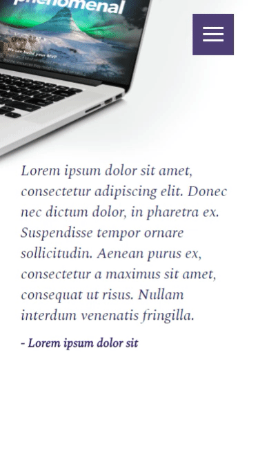
I’m sure you’ve noticed the fancy icon that is animating with the navigation. Again, it’s something that can be done with CSS only.
Animated menu icon
The first step is to prepare our ‘hamburger’ icon. Since we want it to transform to a different shape, we can’t use an image.
.nav-switch {
    position: absolute;
    right: 20px;
    top: 20px;
    height: 60px;
    width: 60px;
    text-align: center;
    background: darken(#654F97, 10%);
    span {
        color: #fff;
        position: relative;
        margin: 28px auto 0;
        &,
        &:before,
        &:after {
            content: '';
            height: 3px;
            width: 30px;
            background: #fff;
            display: block;
            border-radius: 1px;
            transition: all .5s ease-in-out;
        }
        &:before {
            top: -9px;
            position: absolute;
        }
        &:after {
            bottom: -9px;
            position: absolute;
        }
    }
What CSS gives us is pseudo-element which gives us a lot to work with. We can create whole elements directly through CSS and that’s exactly what I’ve done here. My icon is hidden in an span element and it’s :after and :before elements. They are just simple lines with different positioning. What is also there is another transition that will last for 0.5s. If you remember, we are adding in JavaScript .active class to our icon when it’s clicked.
In .active state, we just need two out of three lines on our icon. Because pseudo-elements are positioned absolutely, we will use them to create an X.
.nav-switch {
    ...
    span {
        ...
    }
    &.active {
        background: #654F97;
        span {
            background: none;
            &:before,
            &:after {
                top: 0;
            }
            &:before {
                transform: rotate(45deg);
            }
            &:after {
                transform: rotate(-45deg);
            }
        }
    }
}
With a simple transform, we will get our active state and with a transition lasting 0.5s, the transformation will be animated.
And it’s done. A fast and simple way to create a nicely responding menu.
If you’re a CSS coder you can now go and create some really amazing designs. If you’re looking for a coder to do this for you – well you’ve come to the right place! Get in touch with us and we can work with you on your next digital project.